The Ideal Free Website
As a small business owner you can easily create your own perfect website for free or for a low price. In this blog post we’ll explain how!
What’s the purpose of easy-to-use websites?
When I make websites or consult on their marketing, the first question I put to my clients is, “What’s the purpose of your website?” This question often reveals many of my client’s misconceptions. The first response is usually something like “to inform the public about the company’s operations” and with the second function being “marketing.” This is certainly true, but neither of those two things are measurable. This is especially true if you buy traffic for €1000 as it is very difficult to demonstrate the utility of the website compared to the ads.
The intention of company websites is to acquire customers. Usually, offline services are not directly sold online but are used to gather contact information for potential customers. The more contacts gained the better a website performs its stated task.
So aim to gain contacts.
Planning Your Website’s Appearance
Your website’s appearance should be in line with your company’s logo and visual identity. Use your brand colors, logo and slogan. What and how you communicate should be in line with your other activities. Moreover, don’t get bogged down trying to decide on the style and theme of your website. Remember, the purpose of a website is to gather the contact details of potential customers. Your site need not be a piece of art. Most successful online stores have a very fixed and boring design. Amazon.com, eBay.com or the Finnish site Huuto.net are not beautiful websites but they work really well.
Limit the number of features of your website, otherwise it may result in pages that are too difficult to use. A few years ago it was popular for websites to use Flash animations. Flash technology can create visually beautiful pages with many moving properties that from a user’s point of view are difficult to use. Special techniques or approaches that differ from the normal user experiences can end up taking a few minutes to learn. The average user should still be able to understand your site in less than 10 seconds. If the user does not understand the logic of your page in 10 seconds they’ll go to your competitor’s page.
So make your web pages easy to use.
Model for the Perfect Website
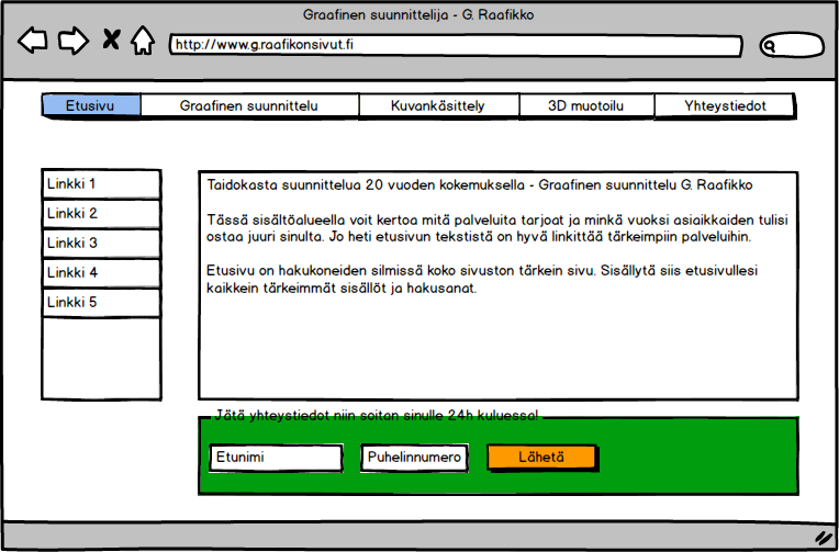
The below picture is an example of a perfect website. On the top of the page is the main navigation bar, where a user can go quickly to the desired page or section of the site. More specific links for a section of a website are more commonly found on a sidebar. So if you have a section that can be navigated to on the main menu bar, the sidebar could have links to examples of your work.
On each page of the perfect website is an easily discernible contact form.
Create Perfect Websites for Free
You will find numerous tools for creating free web pages. WordPress is the best in our experience. There are endless themes and extensions to modify your site. WordPress is also quite fast and search engine optimized. WordPress offers two options. A version that is installed on your hosting service and a ready-to-use version at WordPress.com. It is not difficult to hire a hosting service but it can costs a few extra pennies and take more time to create your website. So if that’s not an option, here’s how to create a free website on WordPress.com.
1. Go to the address WordPress.com and create a free blog.
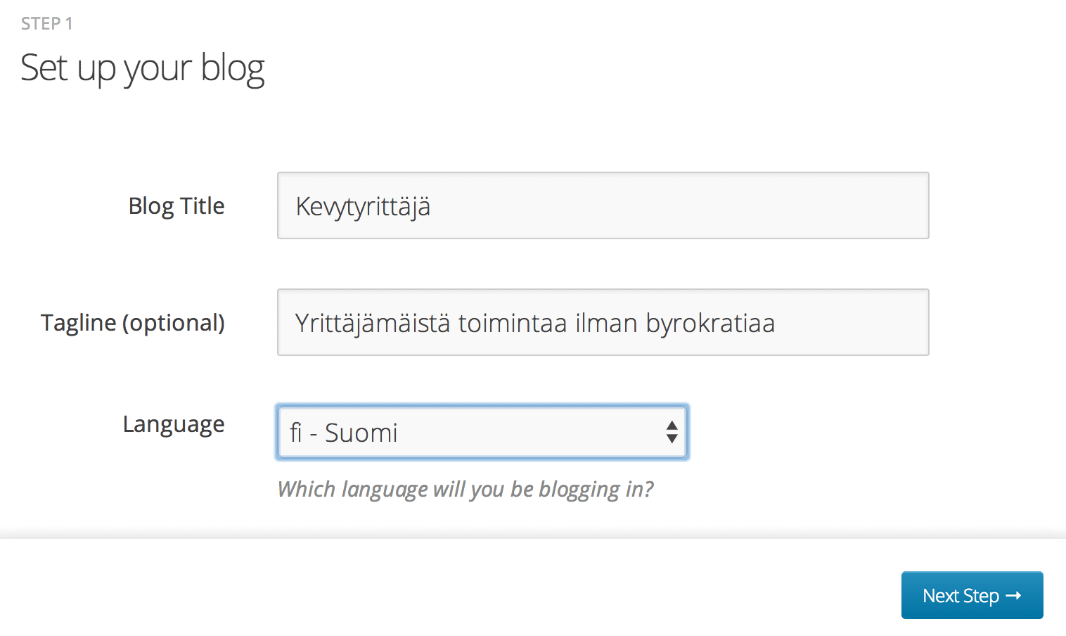
2. Täytä tietosi ja valitse blogin nimi
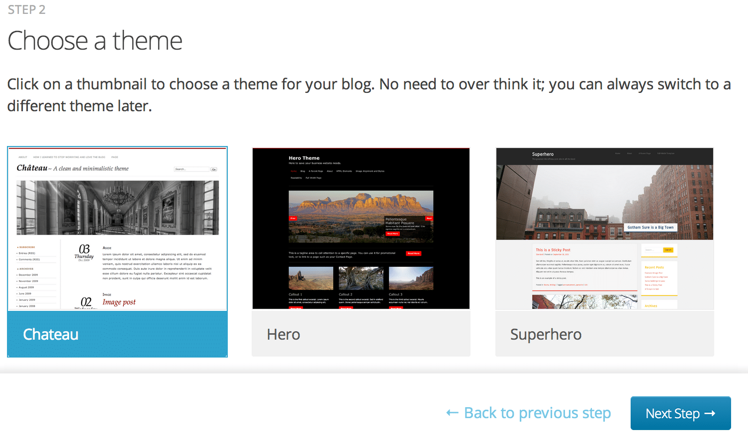
3. Select a visual appearance for your website.
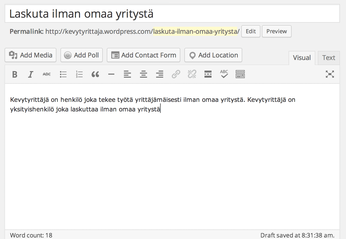
4. Create your own presentation page of each service. Select"Pages" then "New Page".

5. Enter a maximum of 200-400 word description for each service you provide.
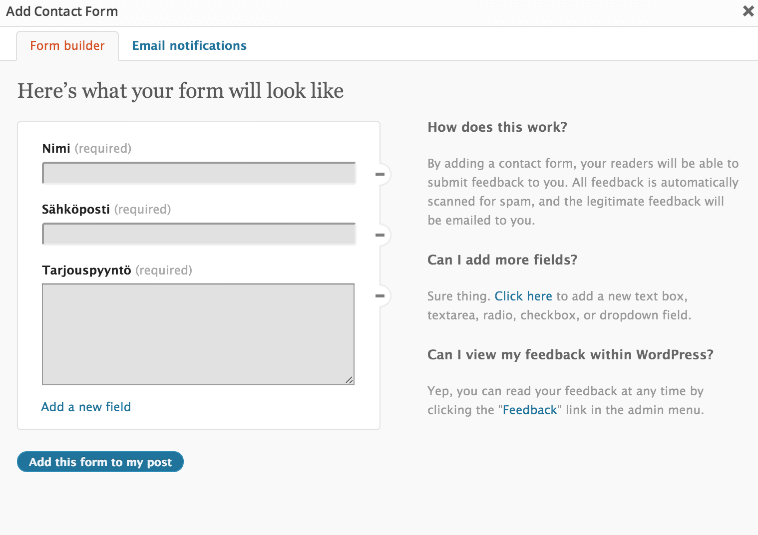
6. Add a contact form on each page. Press "Add Contact Form". Remember to choose "Email Notifications".
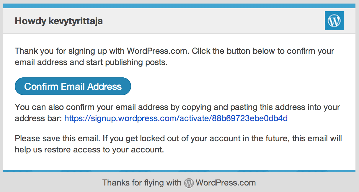
7. If the publication was not successful, you need to confirm your account by pressing “Confirm Email Address” in the e-mail you’ve been.
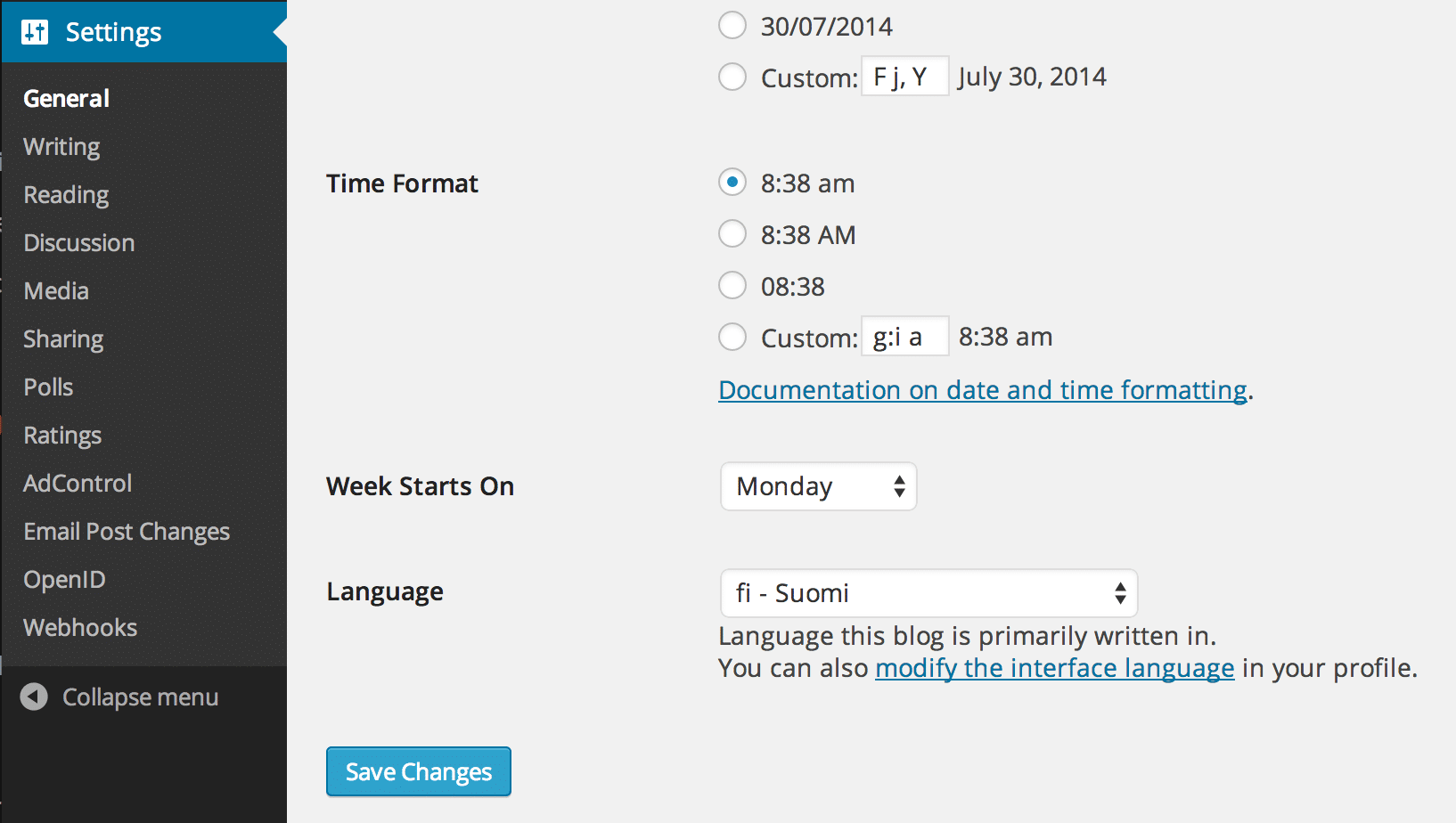
8. If it’s not already in English change the language to English.
9. Create your own URL for your site (domain names costs about €15/year).

Now you have a perfect website, so you can start marketing!
WordPress.com allows you to modify the appearance and operations of your website almost to an almost infinite degree. Familiarize yourself with more precise advice here: Customize WordPress.com.
WordPress in Finnish can be found here: WPOpas.fi.
Professionally Created Websites
If you want to hire a professional to create your website, it pays to seek out freelancers. Large advertising agencies and production houses will charge tens of thousands of euros even for simple projects.
Remember that your website should flow in a simple and orderly manner. Thus design should focus on the function and a contact form should always be clearly identifiable!


